As i said earlier i would look at face book symbols before i move on, this has helped me a lot, iv decided im going to use one of those symbols and split it so it looks as though its about breaking up.
Monday, 29 March 2010
Image Task 1
For the relationship article, i just want something simple like a basic pictogram, using the coloring of face book. As its only a small space it has to be clear as to what it represents, and fit on the page as there is another image going onto the same page. There are quite a few things to consider so i really want to keep it basic, the ones below are what i found but they are a bit fussy and obvious. I think i need to look at face book in a bit more detail at their symbols first!

Image Task 1
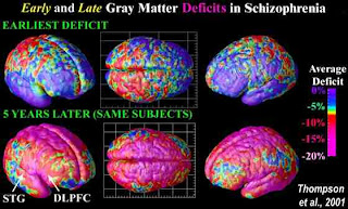
From reading the article 'this column will change your life' i basically was slightly confused and that is sort of the message it was giving that the smaller obvious things with numbers confuse us. So my initial though was to go with one of the quotes ' 1 billion seconds is....' and illustrate it from beginning of time to future but this idea was so weak, i had a rethink and when with the confused mind. Thinking of the brain and scans, schizophrenia, which is what the images represent, i think i am going to continue with something like this, the colours are also really interesting in showing the development of schizophrenia in the one below, this is another aspect i could take from it.
I remember watching a film, no idea what it was called but it was on schizophrenia and i remember all the writing in it. The above is an example but the way people with schizophrenia write is quite amazing, the above isn't a very good example but when they are in a truly confused state the writing turns into symbols and shapes its really interesting. This is another idea i had to interpret some of the confusing quotes they given and put them into the style of writing of a schizophrenic person.
Image Task 1
I have initially looked at cells and cells attacking each other, for the doctor doctor article, so i can get a deeper understanding of what they look like in detail, as i think i am going to demonstrate this is some way for the main image. Its actually quite interesting seeing something that you never really think about so close up, the texture of them is really nice.
Image Task 1
As my articles are from the guardian i have begun by simply googling images from the magazine to get a feel for what their current images are like. I am very surprised by what i have found, it is not at all what i expected, it is much more free and illustrative and i actually quite like it. I especially like the bottom one, it looks like different media has been used which interests me, i assumed everything would be vector based or photographs.
Friday, 19 March 2010
Feel Good promotions
This is quite fun, and typical of feel good drinks, although i dont really see the point of it. I have noticed with a lot of things created or used for promotion for feel good are pretty pointless, and aren't the things that will introduce a new customer or wider customer base for them, such as the above, or the video with the wig and bottle dancing made by a student. They need something new and different, clearly they want to maintain the same basic ethos and tone of voice, so instead they need to steer it in a slightly different direction and i feel we have achieved this.
Thursday, 18 March 2010
Design in context
These advertisements by Vitamin Water are the same sort of way we want to advertise our drinks, we want them to be fun and bright remain quirky and along the same sort of lines of how they present themselves currently, but in a different way, an example would be the bottom advertisements, i have in mind a runner and throughout the panels the persons speeds out though lots and lots of bodies and then the drink on the final panel. We want to keep them up beet but in context with the sports we have advertised.
Sunday, 14 March 2010
Company slogans
In feedback from our crit, it was suggested we needed to add a slogan or tag line to enforce our campaign we were planning on doing this, but the feedback has pushed us forward to move with it sooner.
Gatorade. Is it in you?
Life's a sport. Drink it up.
coke - the pause that refreshes
sprite - obey your thirst
luco - aids recovery
relentless - burn fire to drink
feel good drinks - All our Feel Good Drinks are made with 100% natural ingredients, contain no added sugar or nasties and count as one of your five a day. Come and say hello
Competitive campaigns.
Red bull is one of the most popular energy drinks on the market, there current slogan 'red bull gives you wings' is marketed through advertising, sponsorships, sports and celebrities. Although red bull is one of the top energy drinks its widely known it has health risks yet its marketing campaign is so strong people still drink it on a daily basis.
Powerade is another sports drink, it is manufactured through coca cola, it was first introduced in 1988. Powerade is a full of sugar and syrup and has been criticised for being deceptive with its advertising.
Competitive campaigns.
The original lucozade packaging to present day is amazing, i cant believe the difference. The first looks so clinical almost like a cleaning product. Its so untouched and fresh of the market. Looking at the present packaging compared to the original it looks so commercialized and fake, i can see it in a different light not its so strange. Lucozade used to present the slogan 'aid of recovery' and it new slogan 'lucozade replaces lost energy' the design of the bottle also shows the shift of advertising, the packaging was changed and the rebranding was massive. Between 1984-89 the value of Lucozade sales tripled, thanks to the rebrand.
A nice interesting bit of information about lucozade is that one liter of Lucozade Energy contains 700 cal and contains 0.01% of ethanol which kept muslims from drinking it. Until in 2004 the Muslim law declared no one would be committing a religions crime by drinking it.

Advertising campaigns
Most of these campaigns i have never even heard of the drink, so just shows how badly they have been advertised. The one above i feel is really cheesy and obvious for an energy drink, this is not at all the idea we want to present with our campaign.
The above clearly plays on the sex appeal this is also not something we want to present with our drink. Especially as its not true, we want to present reality the truth of how good it is and what it can do/make you feel good.
Again iv never head of this drink, but i do really like this campaign bursting out are the 'things' the drink can do for you, this campaign is more aimed towards our original idea, however and not what we are currently trying to present with natural energy.
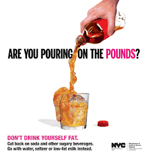
The message within the image below is really interesting, laying on the idea of pouring fat, although it isn't really what we are going with, if definitely has a strong message within it. Which is something we lack at the moment, we really need something to pick the campaign up, with some sort of slogan.
Advertising campaigns
These 3 advertising campaigns are for Gatorade they are appealing to the same 'young adult' audience we are, but they also dont classically use muscle and exorcize to advertise themselves here, which is really interesting and i haven't seen this before. We are looking at promoting the every day general activities and exercise and promoting these with feeling good. Similar to the adverts below they are concentrating on being motivated and active through obvious and simple sport, giving the get up and o feeling.
 '
'Tuesday, 9 March 2010
Rebranding
We have decided to move forward with 'rebranding' the drink as a healthy energy drink. The new audience will be young students/adult who are interested in keeping fit and eating healthy. i have looked at some other brands that have rebranded themselves and become more established on the market.


Juicy waters rebranded themselves as 'this water' the new design is much more contemporary and in all looks more delicious to drink. I also feel even though this isn't advertised necessarily as a healthy drink, it is a healthy alternative to other drinks, similar to feel good drinks. I really like the illustrations and large type face, being the most prominent designs on the label, the rest is just plain and i think this gives a really nice 'loverly jubbely' feel.
Lucozade, originally seen as a house hold medicinal drink, rebranded its self as an energy drink using olympic champion Daley Thompson in 1983-84 some one who needed limitless amounts of energy in order to perform his sport. An ideal match was made for the rebrand campaign by introducing a world know athlete drinking a 'high performance' drink. The message Lucozade send out is what ever your level of sport, preparation is key and, Lucozade is a part of that. I think it is important we take some of theses key aspects Lucozade have held onto and use them wen considering our 'rebrand.'
a really useful Lucozade website ... http://www.brandrepublic.com/InDepth/Features/232378/Superbrands-case-studies-Lucozade/
Subscribe to:
Comments (Atom)


