Saturday 4 December 2010

Louise Fili

These labels designed by Louise Fili are the style I feel most influenced to design like for the Laura Ashley brief. To link the packaging to the product and to add some expensive quality I feel its is necessary to use the metallic silver in the packaging but to in some way feed information to the customer about the flowers and birds. Only a small amount of text I feel is necessary for this packaging design as the product is strong enough to speak for it self.


If in fact I decide the packaging is too empty to not include illustration or it doesn't link well enough to the contents, this simple illustration of small information laid out, similar to the below labels would work as a back up for the packaging. However I do want it to be as simple but expensive looking as possible.

Thursday 2 December 2010

Packaging


All of these images are from a book I took out of the library of which I have lost the name for, part of my brief asks for the products designed to be packaged. A this stage in my development process I dont want anything fussy or over decorative, but I still feel its necessary for me to create something which is also influenced by the term'speciality.' The top image of bottles has a very simple design to it consisting of label and logo, it is the use of colour that makes this product look expensive. Most special products on the market have a very simple but sophisticated look to them and not lots of imagery and information with bright bubble colours and type jumping out at you. This is not what I want for the packaging for the Laura Ashley brief.


This second photograph follows a very similar design layout to the top, this image gives me the idea to box my products and use a label which can be adapted and transferred across the range of products. This will give them an expensive feel encasing them to protect them, hinting at an expensive precious item.


This is a very feminine and pretty packaging and does remind me of Laura Ashley, I could easily adapt this style to my packaging, however I would keep it much simpler with no decorative pattern being used on the outside with the contents being highly patterned. I really like the strip of ribbon and sticker used to fasten the box together this adds an expensive feel, rather than it simply being glued together.


The over all product shown above is not what I am looking to develop for my packaging, but there is one small part I like and feel could be useful for by design process. The side of the end 'ginger' box I really like, and find very pretty for an informational side. This is much more appealing to me that the front design on the first 3, they are much too full and cluttered in comparison.

Sunday 28 November 2010

Wall Stickers

Something else I found on notonthehighstreet.com are these wall stickers they are a really good way to apply decoration to a painted wall. Its also another way I can apply my design through another media offering another item to sell. Laura Ashley dont sell wall stickers as they are more traditional and I am too far on in my design process to add something new to my brief, however its it worth investigating and proposing on the boards or for future briefs.


Colouring in Wallpaper

I have found this wallpaper on the website notonthehighstreet.com they have some really quirky gifts and things for children. This wallpaper is amazing and very interactive for children, they can colour it in and have fun and wont be drawing on any other walls. Its not exactly a direct link to my Laura Ashley brief but I really like it, definitely worth looking at for a future brief.

Friday 19 November 2010

Bubble & Balm

Bubble and Balm are one of the first companies in the UK to offer Fair-trade body care products, their ingredients are created using natural plant based ingredients. Bubble & Balm are in support of sustainable palm oil through the green palm production. Their packaging is made through UK recycled card boxes and UK made plastic bottles containing recycled bottles. There use of aluminium is made in the UK and contains around 50% recycled aluminium.

These soaps are very simple in design but I think the eco values they hold help support the strength of the product. Whilst still very affective, I have mentioned I want to keep my design simple but expensive looking. This product is an example of for me and my design ideas too limited and plain, this design could be so much more with different print finishes.

Thursday 18 November 2010

Lassi

Lassi is new yoghurt drink recently launched in London, the packaging and label are designed by The Hose London. Before I started my initial research this is pretty much exactly what I had in my head for the new design. Very simple with the foiled or metallic affect to add that little extra touch making it look expensive and desirable. I really like this type of design, I think it really helps in such a full and busy market, especially when these types of drink are quite expensive and quirky.

Ikove

Ikove are an organic beauty company and their belief is that nature can provide all that humans need. Nature knows what works lasts and what survives. Their inspiration is nature and its power and balance is used in product development. They have very similar values to The Body Shop in their Fair Trade and Sustainability and believe in preserving the environment, similar to The body Shop money made from their products goes into different schemes, Ikoves ploughs money into preserving the rainforest and Amazonian families.

A scheme unique to their products, which is really interesting and a similar idea could be applied to my redesign is that they have partnered with artisans located in small communities and they offer Brazilian handcrafted products (wooden boxes) made from fallen leaves and arms of Buriti palm trees. I could propose something and design a similar styled product for the special 1 month body butters to be encased it, this would make the product more of a limited edition and speciality product than a best selling range, this could be a really interesting concept to look into.


This product is really quite different, I don't think it necessarily looks like a beauty range this could perhaps be due to the colouring and it almost reminds me of christmas time. However this aside I really like the illustrations they have used and linked the colours to make it look rich in ingredient and qualities. But im not convinced this works across the whole range, it for me is very like the 'taste the difference' range from sainsburys.

The art File

These cards are sold in Paper Chase, they are very modern and not really the style I want to go for, I dont feel they touch the feeling of Christmas and have moved too far into modern design. The blocked illustration and style for me just doesn't work, when I get a Christmas Card I want it to make me feel Christmassy and feel excited, these just dont do that for me at all. Aside from this I posted these cards, to show the simple but effective packaging, this appeals to me far more than the cards any there are only a few snow flakes scattered around the packaging. this is a really simple touch but just add something extra, something worth considering.

Wednesday 17 November 2010

Clippers

"Always a pure, natural product - there isn't a single artificial ingredient in any of the products."

Clippers is a fair trade tea company, they offer organic tea, coffee, white tea, Rooibos and the Japanese style Sencha. Their product packaging is really interesting and exciting to look at, I really like it and as expensive as it is for tea I really want it. Its hand drawn style and simple colouring works really well, this style of packaging is very different from the others, but I do still fell an completely different approach like this could really work for the packaging. The illustration is really simple, almost silhouette in style very plain but the type and information presented pulls it all together and gives it a really nice twist.


Here the illustrations are on the packaging, and they work just as well live as flat illustrations. They are the type of design that jumps out at you because its so different and it really fits its organic and fair-trade mark that its follows, this is something i really want to achieve with my designs.


Naturopathica


Naturopathica are an American based company who have recently redesigned their products with all packaging made from 100% recycled fibres with a minimum of 35% from post consumer material. The have very similar values to The Body Shop and are a herbalist company with many healing practises coming from the Native American, African and Asian cultures.

I really like this new packaging design, the blue of the bottle just jumps out at you and looks so luxurious and expensive. The label design however is what i find most interesting. With the use of herbal extracts, they have illustrated a simple silhouette on each product depending what the ingredients are depends on the silhouette. This mixed with the luxuries blue bottle and simple but still informative product label works really well for this brand.


My main target audience is females and this is a very feminine way of representing a product, it isn't as organic look as it could be, however when they mix the image as above with the hand illustrations on special paper it really adds to the feel of the product. This is something i could take forward and use with my images for the design on the label on the inside and the paper and illustration on the stock for the outside of the product. This is my favourite product design I have found so far and is definitely something I would be drawn into buying.

Extreme Activities 37 Cream

This is a new product launched in America, I really like the shape and style of the packaging and how they have incorporated the product into it, but still keeping them very separate. This style is really interesting for a beauty product and it offers the chance to include lots of useful information or interesting facts on the packaging that your wouldn't normally fit on. this style would be really useful for my month special as I can include all the information I have found online on the outer packaging and on the inside and keep the inner product simple. A second element I really like about this packaging is the fold, its a really different and unique way of packaging the product capturing your attention but also adding extra value to the item.


Lipstick Queen

This product is a little bit different from the Body Shop range however, I have posted it because its simple but very effective style makes it look expensive. The design on the actual product, the lipstick is very limited to just the brand name, but it the outer packaging of the product the 'throw away' part that is the most desirable and expensive looking. This is something I could look into for the Body Butter, I think this style would be very interesting and have a completely different take on the Body Shop design. To keep the contents of the product and outer design very limited, but to have an out box or bag and fill it with design and illustration. This could also be a way for me to include the interesting selling points I mentioned they have on earlier posts. Or alternatively my brief states to make some sort of bag for the product to go in, this similar style could work across this media.


Chopra Adara Body lotion

This is a body lotion product usually sold in a plastic pump bottle, this product was constructed using 100% recycled paper (for the paper portion of the product. The contents are mode using organic products and I really like the feel you get from the packaging of it also being natural and organic, it makes you feel safe as to what your buying into is real and is organic. It really suits the nature of the brand name and this was also used as a one off promotional product. I could use this similar affect for my promotion with The Body Shop, this type of material and style is very fitting with their brand and products. It is in colour too dull as most of the Body Shop products are really colourful, but it depends weather I am choosing to promote the efficiency of the product or the contents of the product.


Ingredients

I really like these posts they have on the website, you can click where in the world the ingredient is from and it gives you some information on it.

"Shea butter has been used by ghanian women for generations to help protect their skin from the dry Saharan winds and its still a beauty favourite today."

This type of information is such a massive selling point and the small post of did you know? This is all really interesting information you can find on the ingredients and the product and especially as its a beauty moisturiser I really feel this will help promote the product even further than just the look.


"For centuries the women of Ghana have used Cocoa butter on their skin in the dry African heat."

The Body Shop Values.

"We believe there is only one way to be beautiful, be natural"

A very strong and meaningful quote I have found on the website, this is definitely the approach I want to use - a natural but expensive look. The quote could also be really helpful when looking at the information I post on my product.


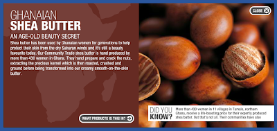
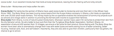
I think its really good they state where all their main ingredients are from and why they source them from their, such as to help fair triad farmers in Ghana. these are all really good selling points but unless I were to look them up on the internet I wouldn't really no much about the product and in what way it was fair triad or helping the planet. These are really strong buying points to a customer and would really benefit the product by including some if not all of them.

The body shop have an aim to make customers feel good about themselves, I would expect most similar brand have or hope to have this same ethos. However this is a new area for me that I had no idea they were involved in. It would be really interesting to look into this a bit more and see if I can include this in some way on the months special product.


One area the body shop are renowned for is testing on animals, I think this is a really positive value they hold and opens up a whole new market that many similar suppliers are missing out on.

Finally another big issue which is always arising in everyday life is the environment and recycling. They take a big part in sustainability and the environment, this again is a big selling point opening up a new market to people who wont buy other products. Its also a massive benefit to the environment which is always nice to know. This is something I have to take into consideration whilst redesigning the product, as it is as much as fair trade a large part of The Body Shop.

Body Shop

I have started my new brief today for The Body Shop, I am redesigning the top 4 body butters for a moth long promotion event. Below are the 4 body butters I shall be looking at and redesigning. I need to keep in mind all of The body shops values when designing my speciality product as it still needs to be inline with their brand. I have posted a current image of each body butter and a small post of information for each butter.

My opinion on the current design is that I do quiet like it, I have never had a problem with it, The product speaks for its self if you have ever bought it, however it is a very luxurious cream which I don't think is put across through the packaging. It is also quiet expensive for a body moisturiser and the look of the packaging could help reflect this a little bit more as you can be put off by the price and I know from my experience the look of the packaging can sometimes help sway me into spending that little bit more. These are the areas I am going to look at when redesigning the new look for these 4 body butters.

Monday 15 November 2010

Galia Bernstein

These images are from Christmas cards designed but Galia Bernstein, I dont think they immediately scream christmas with the choice of colour or choice of imagery however they are really beautifully developed and very modern. I really like how the illustrations are large blocked drawings and she has used pattern to add detail to them. This style of work is something I would like to work on in the future, its very simplistic but holds its own style really well. I do think Galia could have introduced better print methods or choice of colour to make the card look more Christmassy and expensive, I think this would achieve a much more festive card and appeal to a larger audience.


Thursday 28 October 2010

Apron

I found this really good apron, the design of it is really useful keeps everything neat and tidy so you dont loose anything with the added pockets for the utensils. However the design and layout of everything is a bit random and mishmash but the idea works well.

Monday 25 October 2010

Sally Elford

I have found these screen prints and although they aren't wallpaper, I could imagine the illustrations being used across a wall, I think it always looks really feminine when individual flowers are illustrated and used across a wall with a limited colour pallet, this is something Laura Ashley often do for there neutral colour range.

Sunday 24 October 2010

Rules

As the kitchen can be a dangerous place for children I found these kitchen rules recommended to parents for their children cooking. These are really useful and I may include a few inside or on the packaging for the children to read.